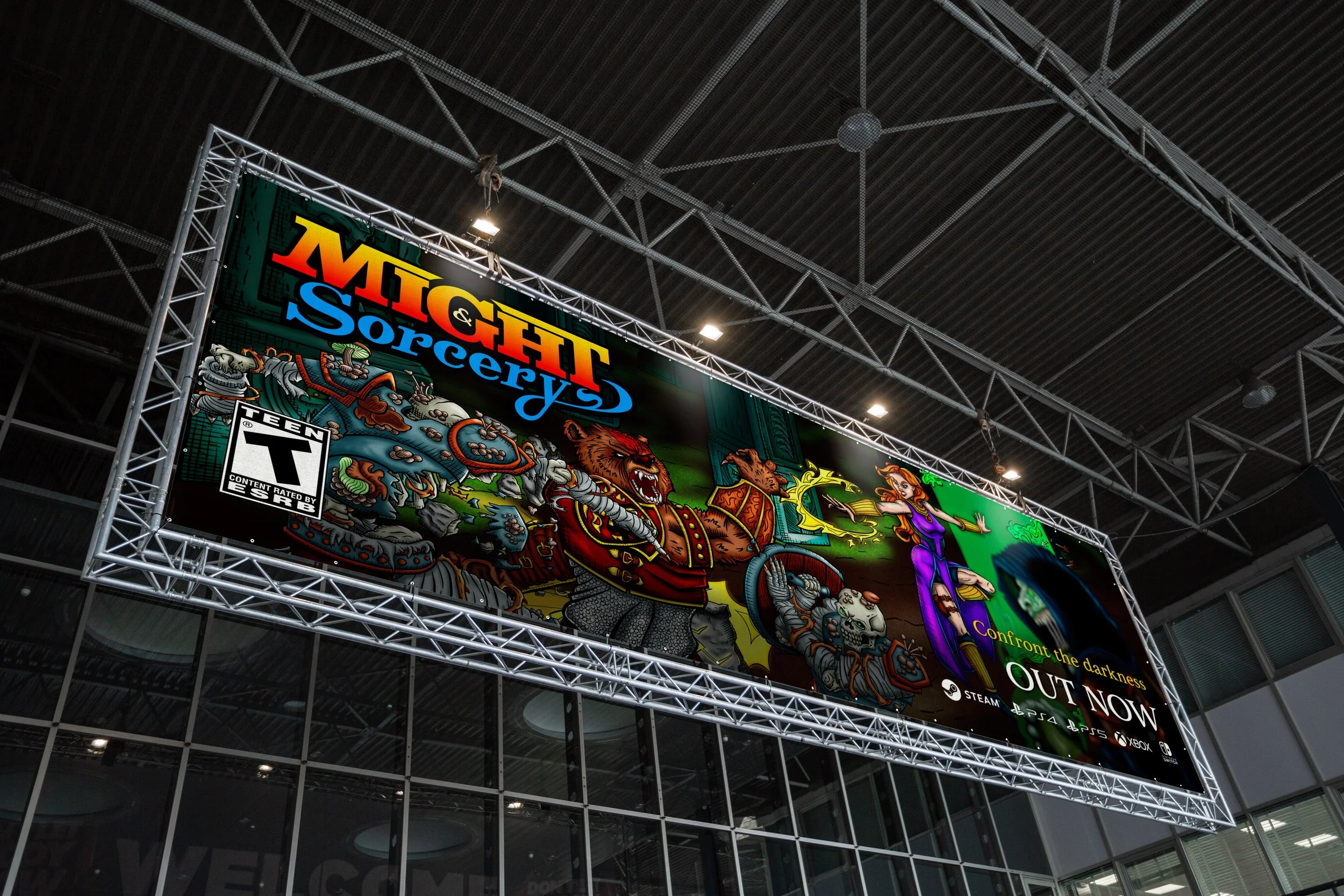
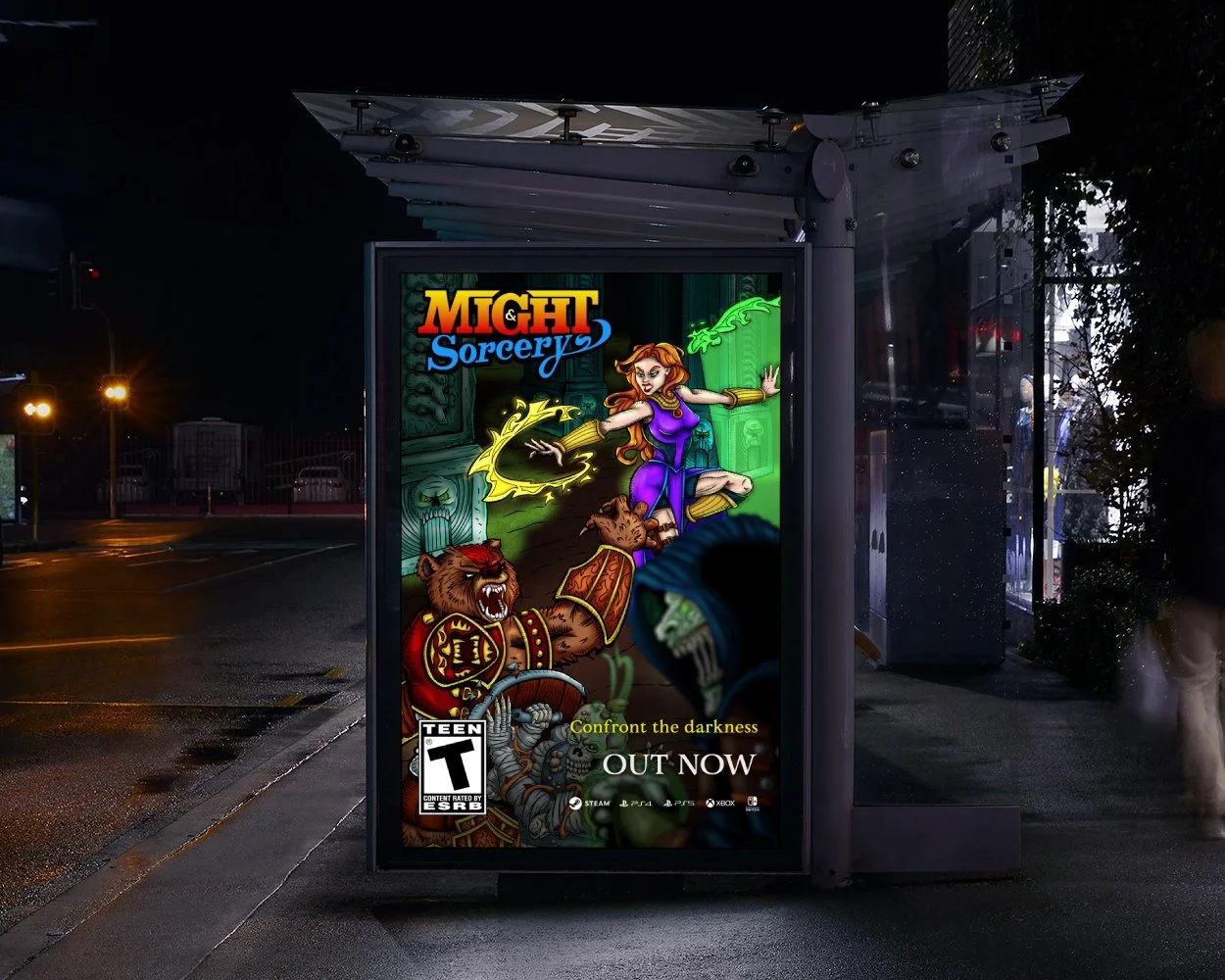
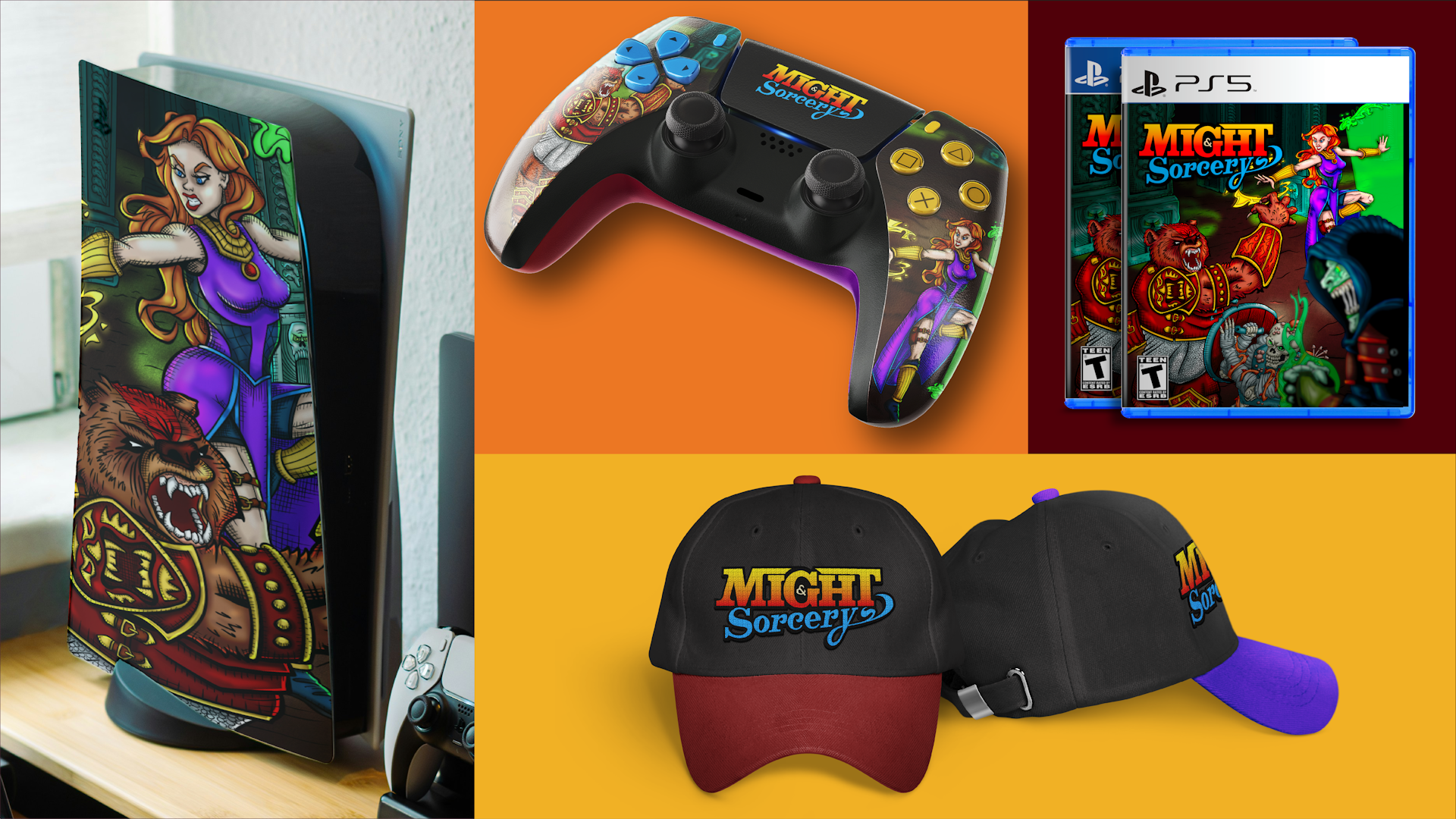
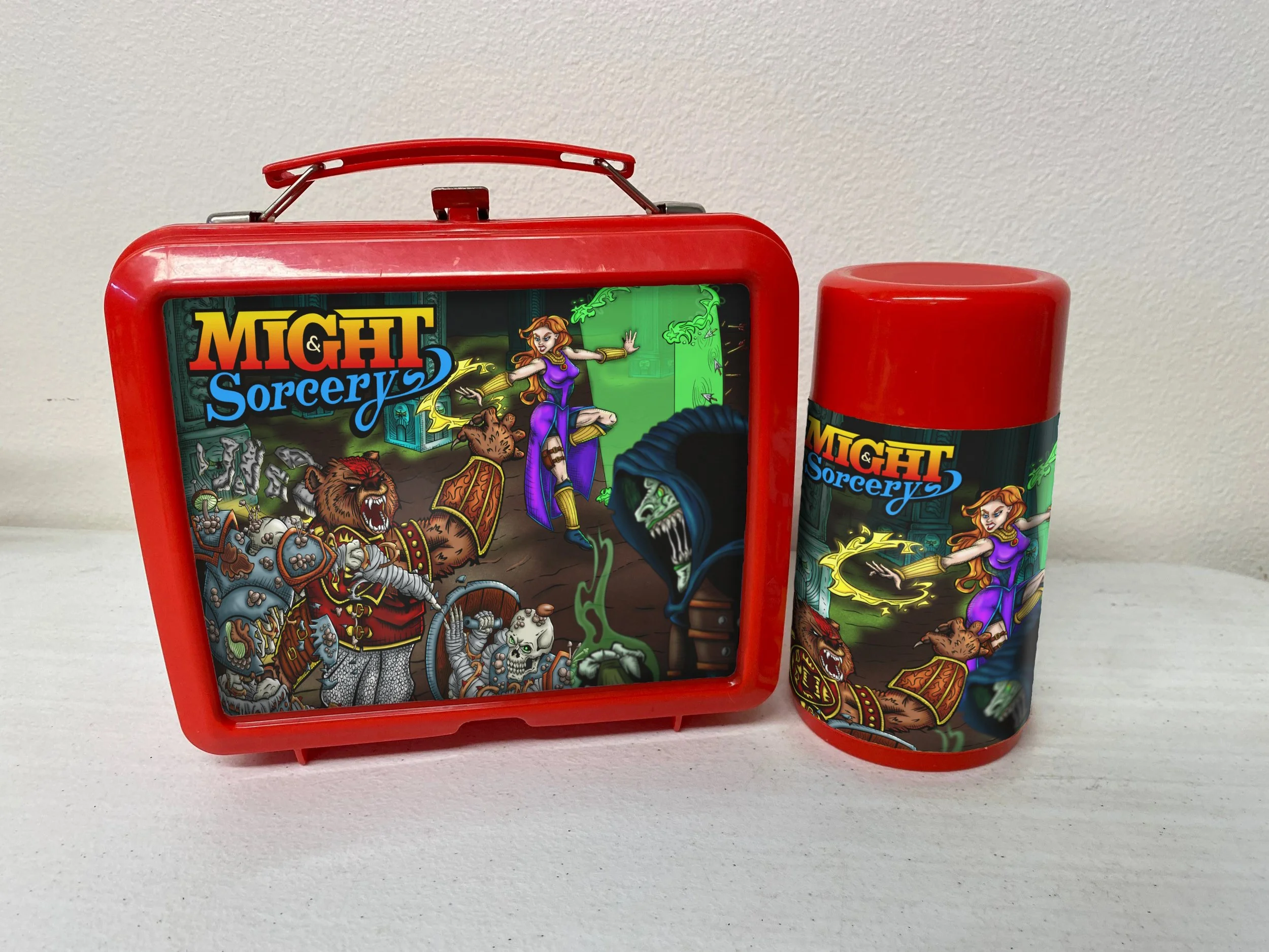
“Might & Sorcery” Joins the Action!
CASE STUDY


ESP
PERSONAL WORK
There are not many things in life I love as much as video games; it's a passion I've shared with my brother for decades. Beat 'Em Ups hold a special place in my heart.
"Might & Sorcery" is our own Beat 'Em Up, brimming with action and mystery in a dark fantasy world.
Creating a personal project featuring an illustration cover for one of the original video game ideas I came up with my brother, was a no-brainer.
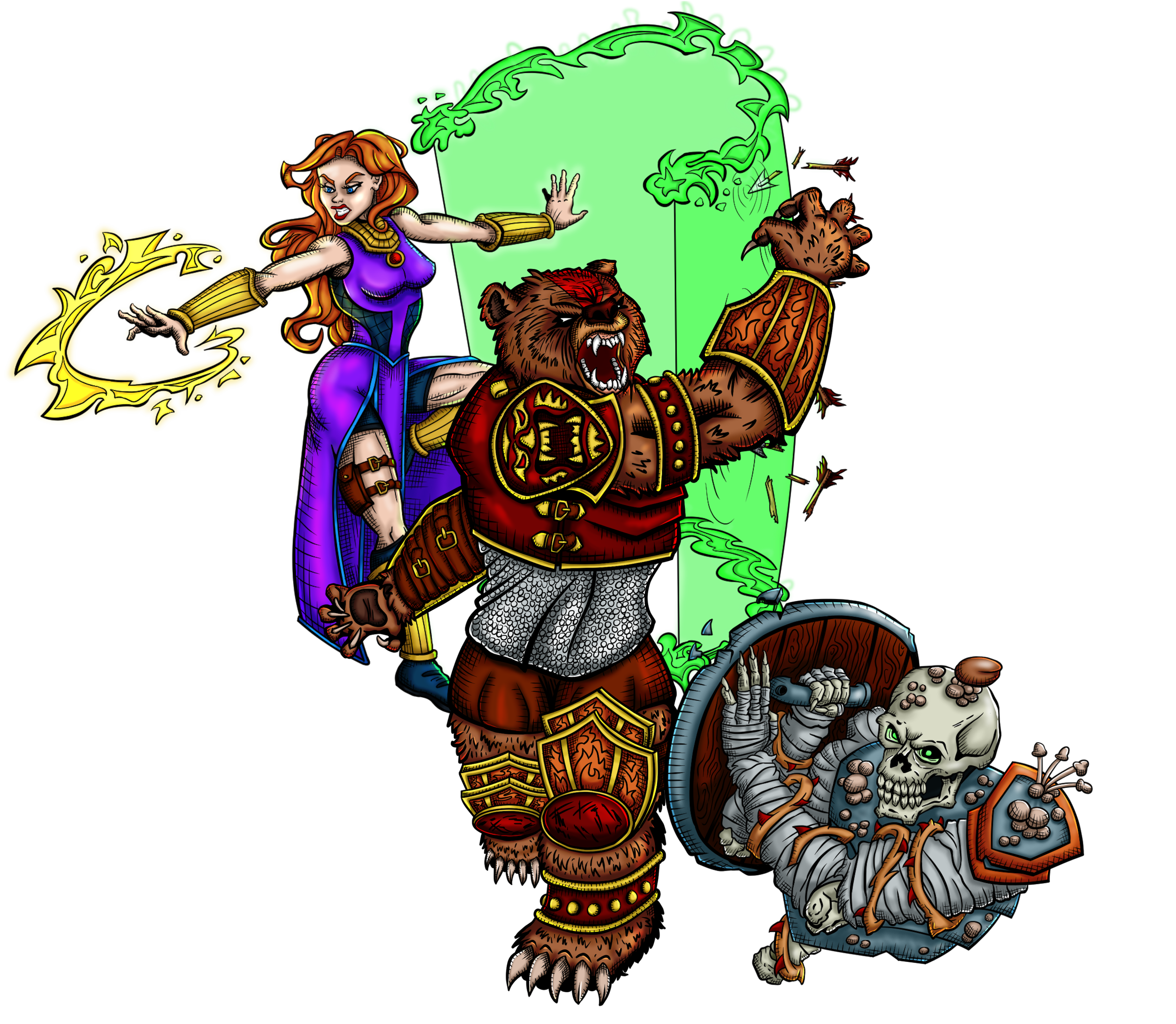
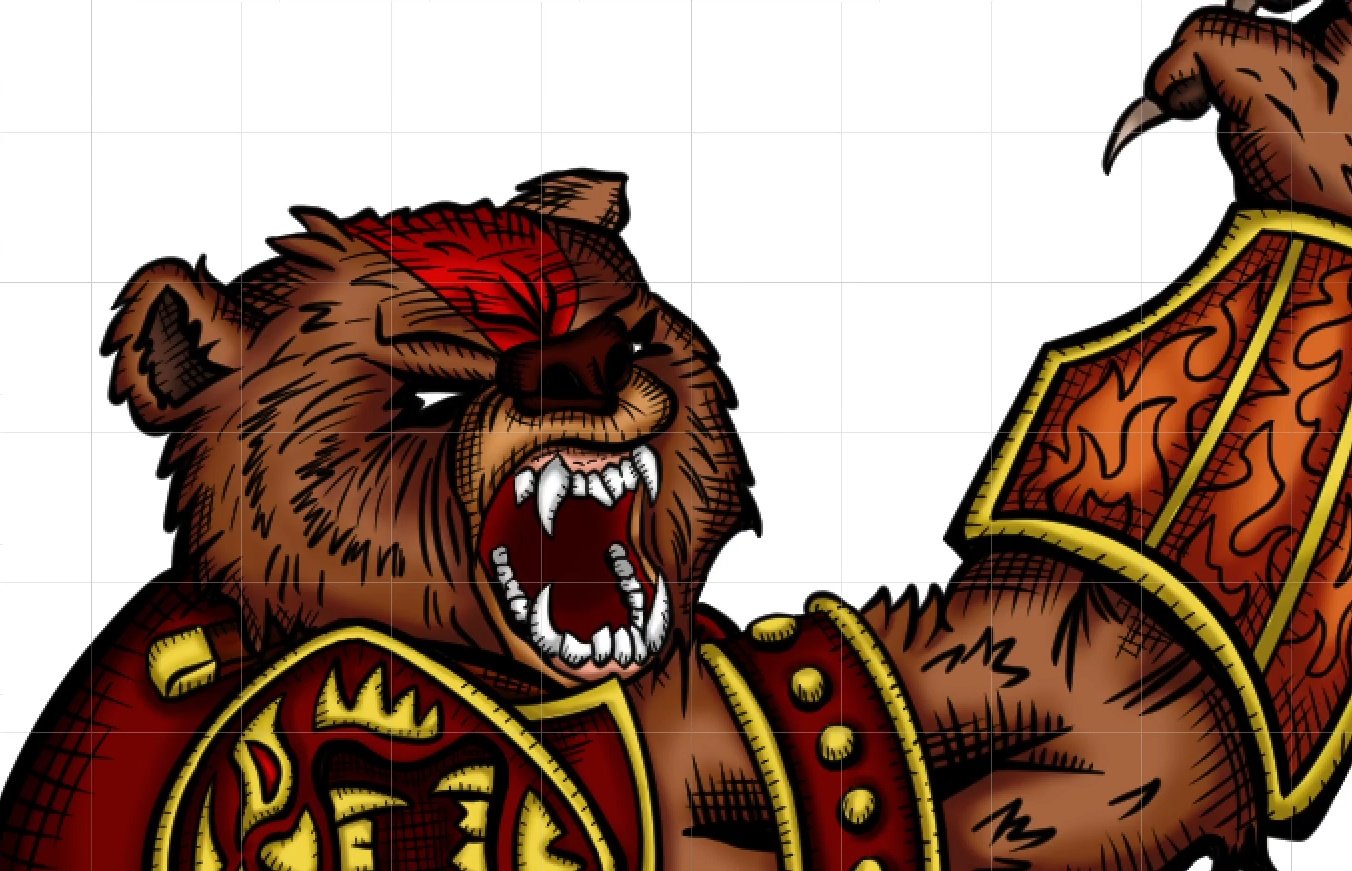
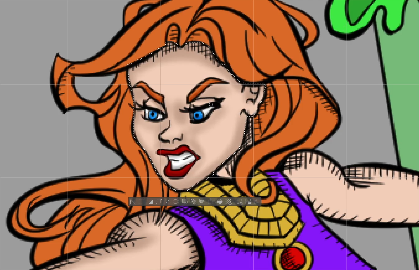
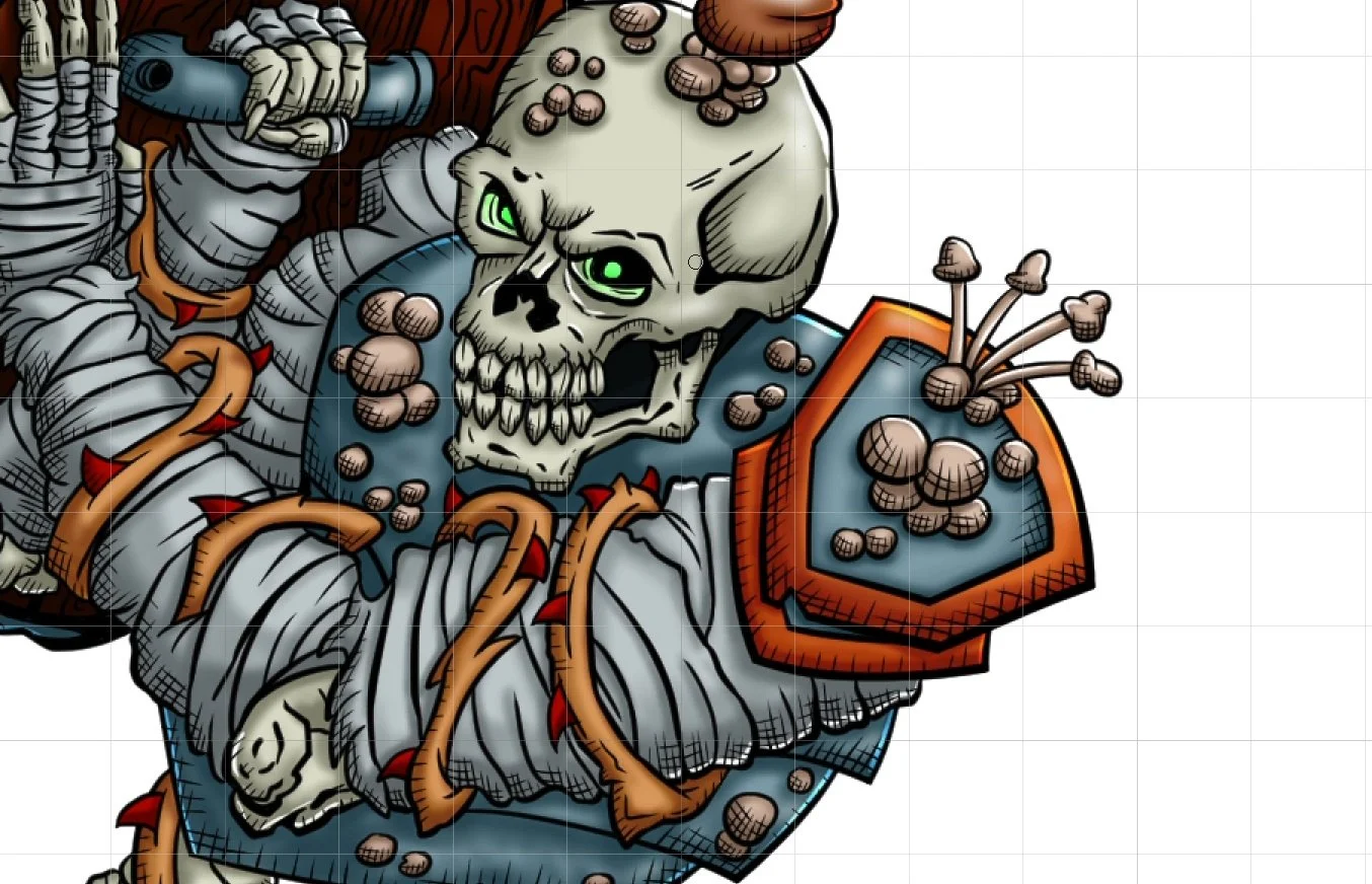
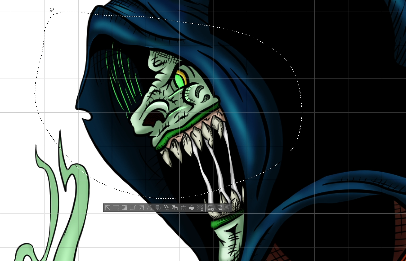
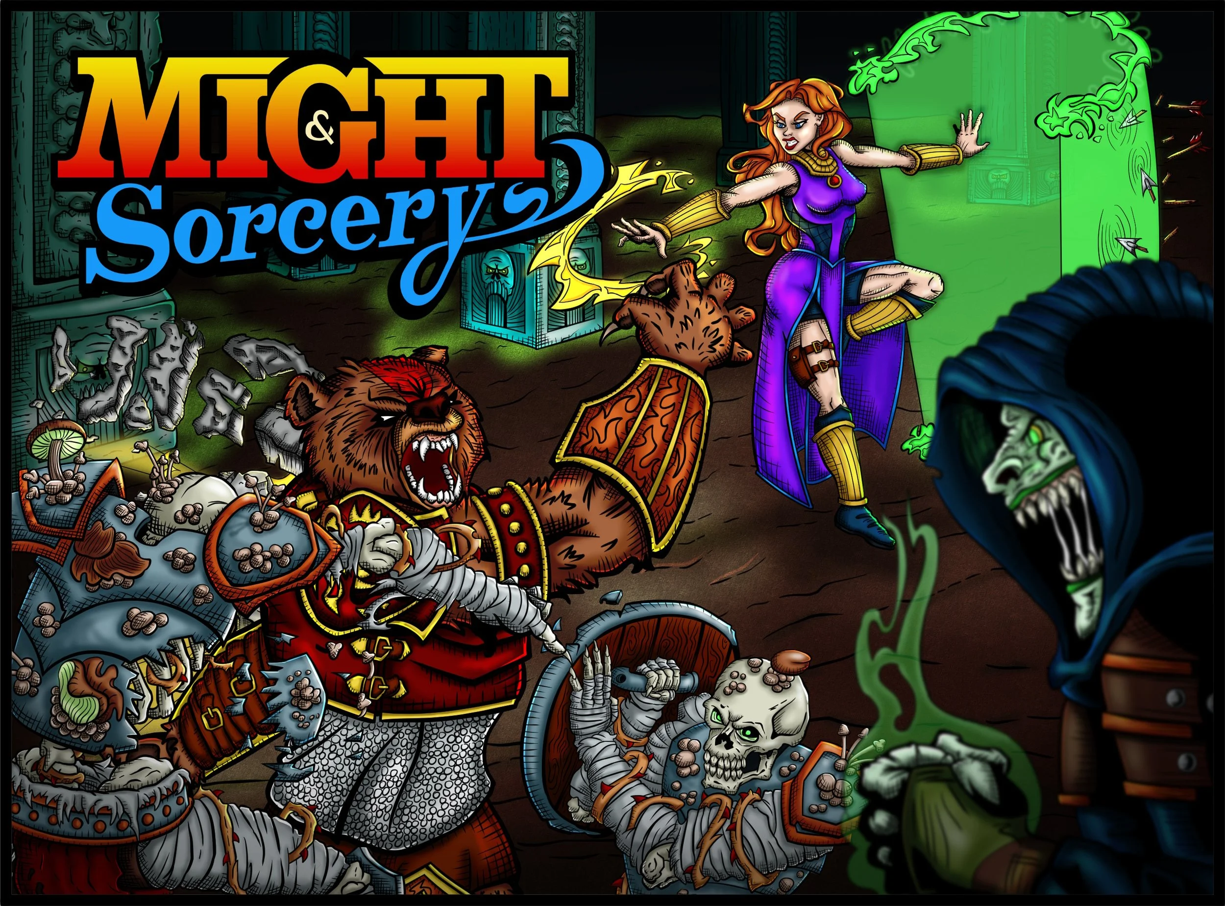
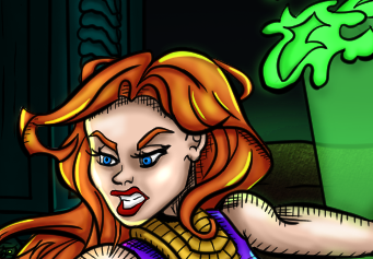
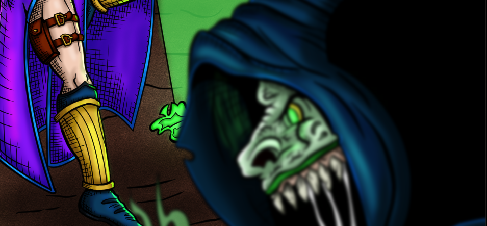
I crafted a hand-drawn illustration depicting a Battle scene between the two protagonists, Magnus the werebear and Saga the sorceress, versus the army of the Tenebris Umbra, deep within an evil underground temple. I also made a hand-lettered logo for the game to use alongside the artwork.
SCOPE
Illustration
Hand-drawn Logo
The Heart of a Classic Beat 'Em Up
EXPOSITION
The early 90s are often considered as the golden age of beat 'em ups, games about taking the fight to the streets, facing evil one punch at a time, the genre was born in the arcades during the 80s, and then invaded the gaming console space with reckless abandon, I was lucky to be there as a child, and enjoyed every second of it.
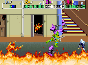
TMNT The Arcade Game (1989) by Konami
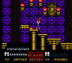
Double Dragon II: The Revenge (1990) by Technōs Japan
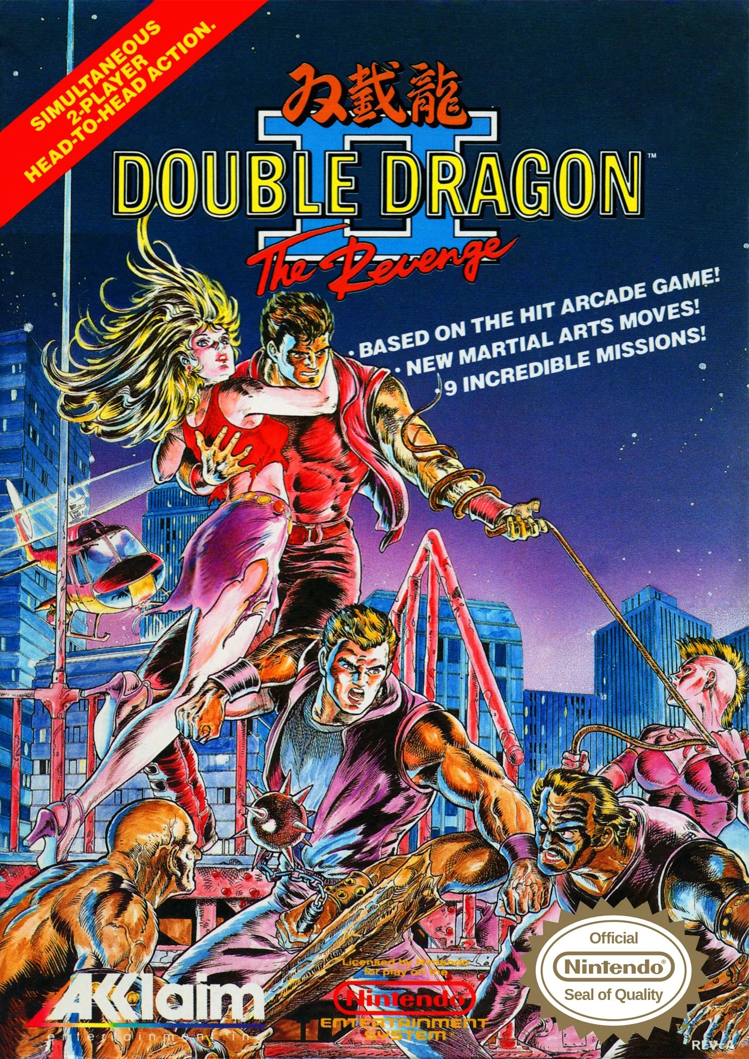
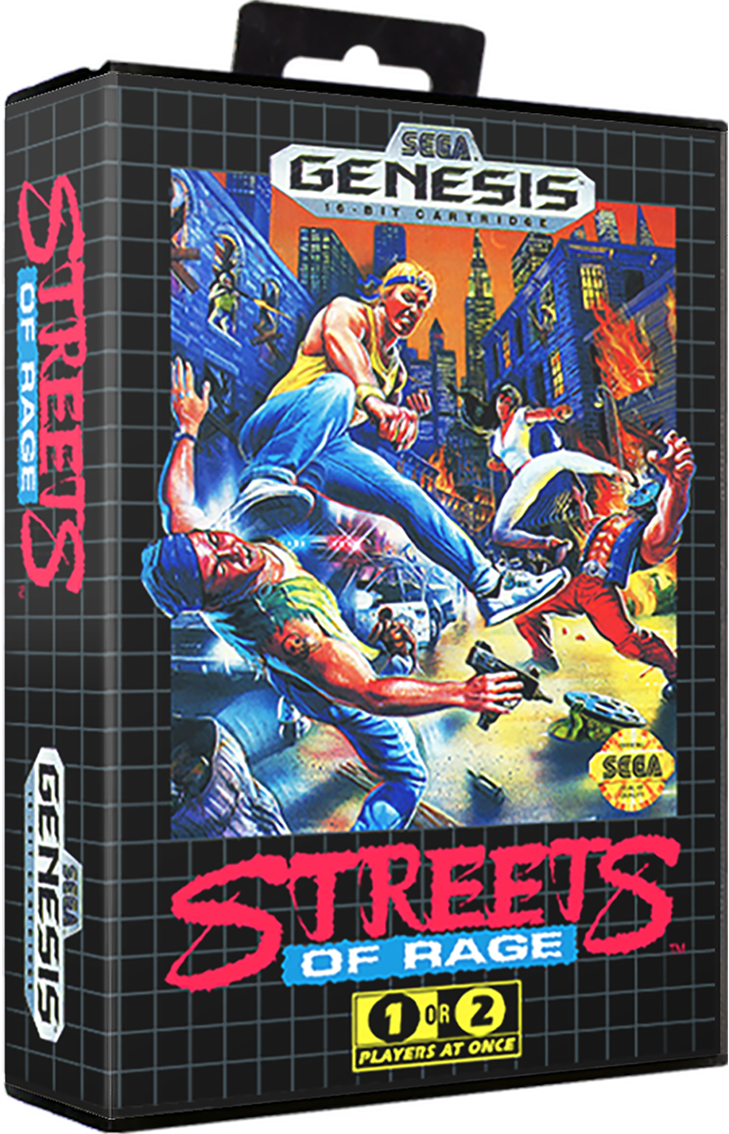
Classics like "Double Dragon II" for NES, "Teenage Mutant Ninja Turtles: The Arcade Game", "Streets of Rage" for Sega Genesis, and "TMNT IV: Turtles in Time" for the SNES showed me how beautiful art could elevate an already great game to a new level in the minds of gamers.
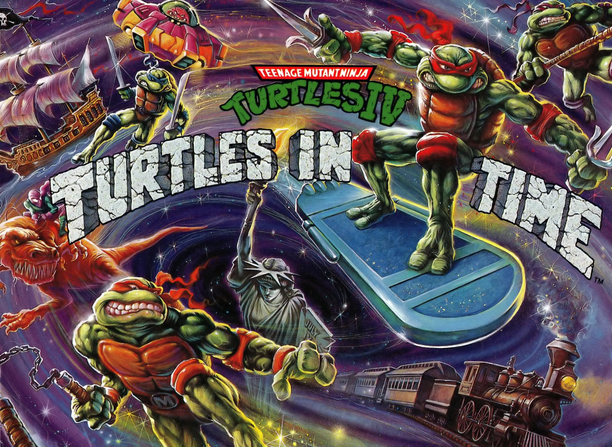
TMNT IV - SNES Cover (1992) by Tom Dubois
Game covers captivated me, depicting larger-than-life heroes teaming up against hordes of enemies. Many of those artworks, decades later, are still ingrained in my mind.
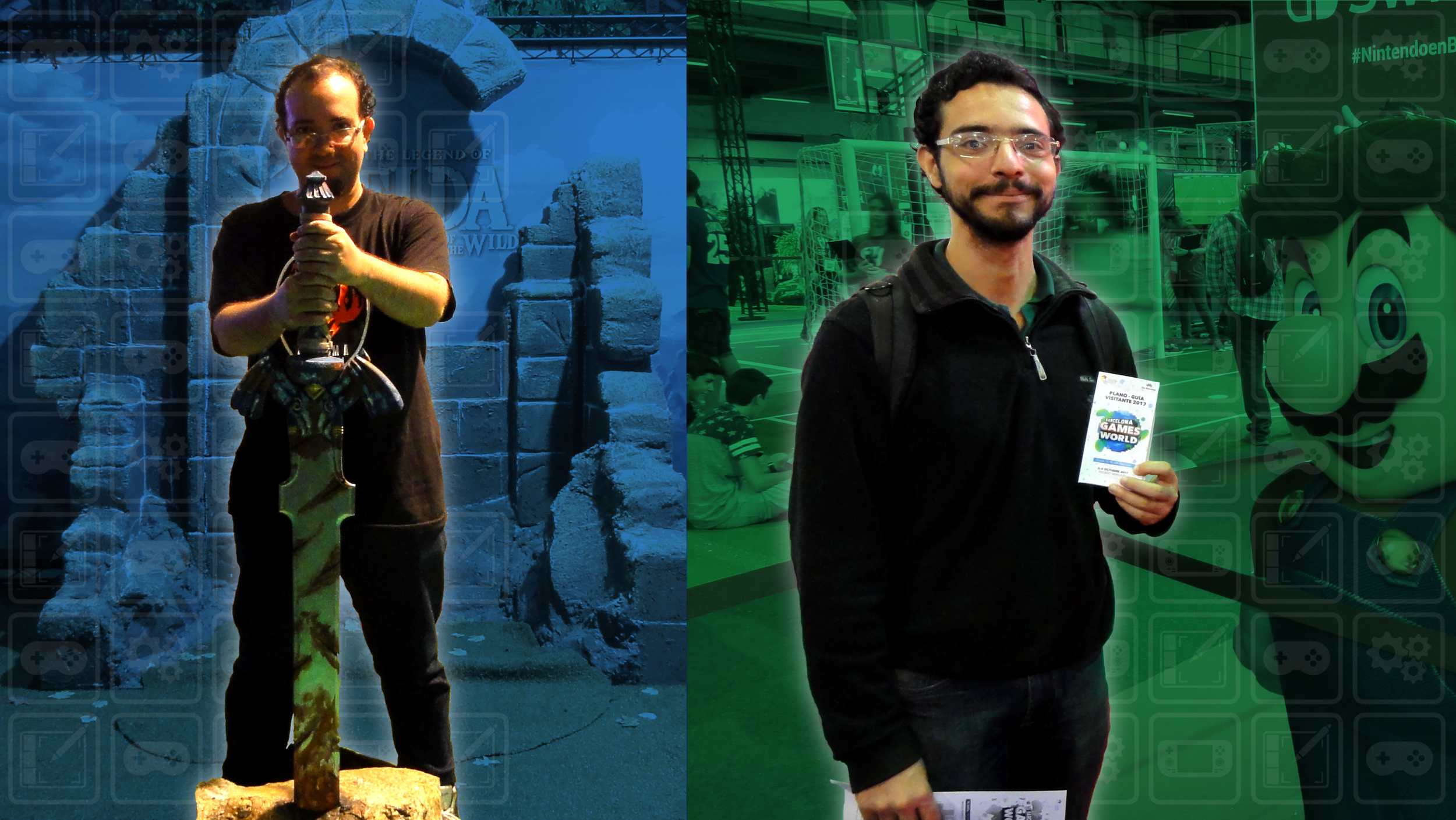
Left to right
Me and my brother (Eleazar)
My brother Eleazar and I grew up as gaming enthusiasts, always dreaming of creating our own game one day. We love trying out and analyzing new games and constantly come up with ideas for potential new titles.
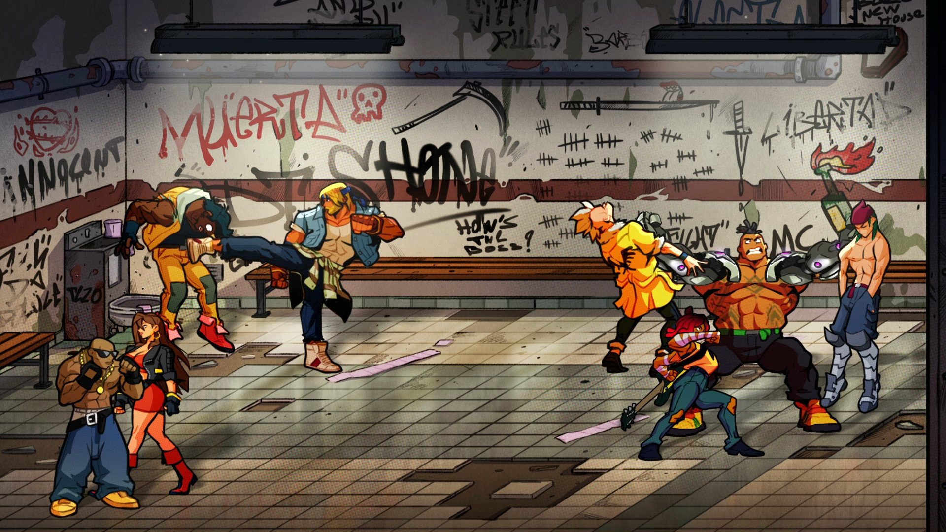
Recently, the Beat 'Em up genre has been experiencing a sort of new renaissance, thanks to games like Streets of Rage 4 by DotEmu, which made us go back and expand one of our ideas for a game: "Might & Sorcery".
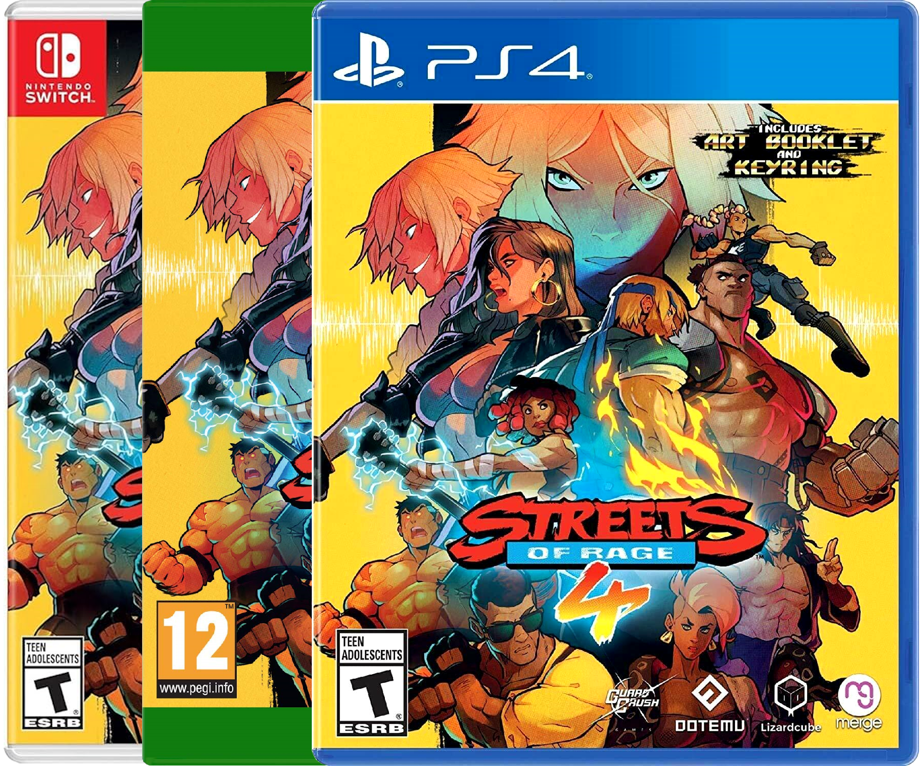
Streets of Rage 4 (2020) by DotEmu
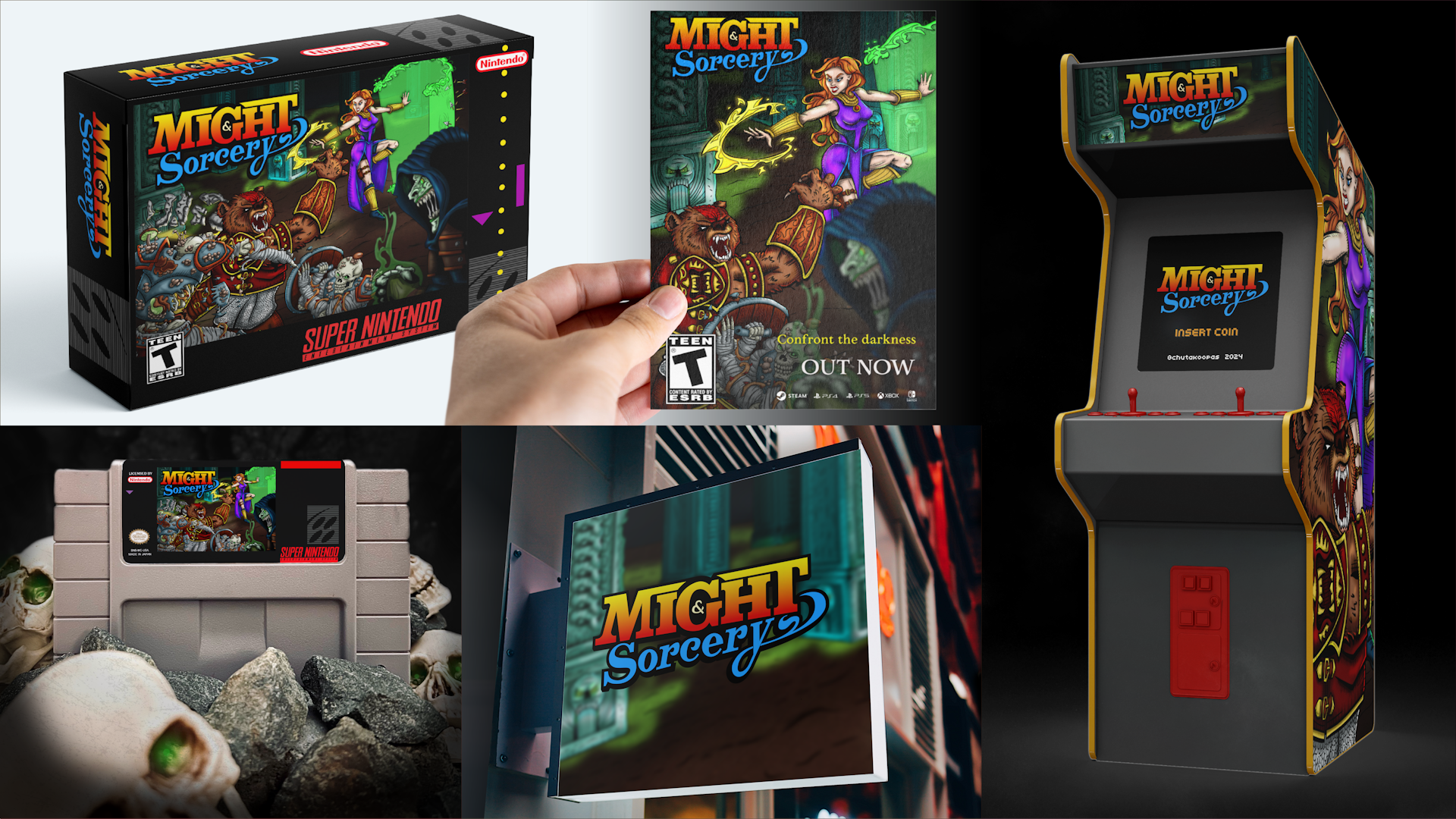
Creating a full-blown illustration for our game to use in the cover and promotional materials was the closest thing to making "Might & Sorcery" a reality, and I couldn't wait to show it to my brother.
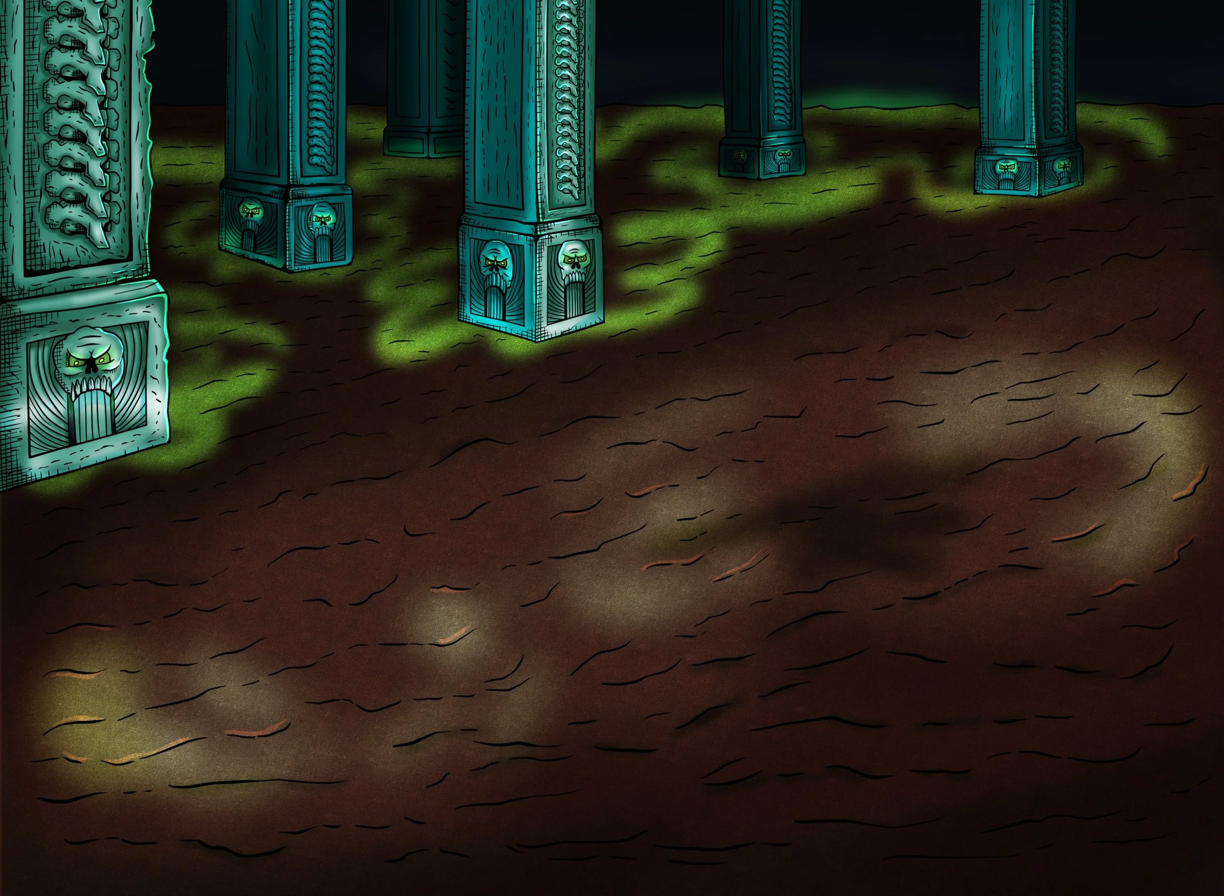
Fighting Back-to-Back in the Depths of the Earth
THE PROCESS
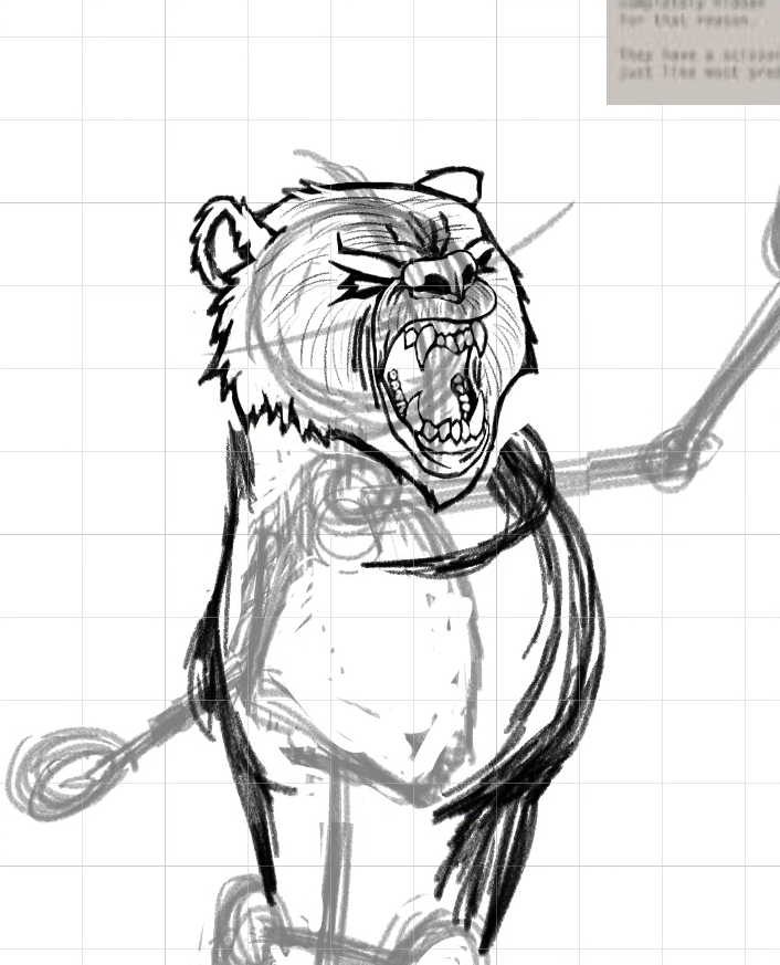
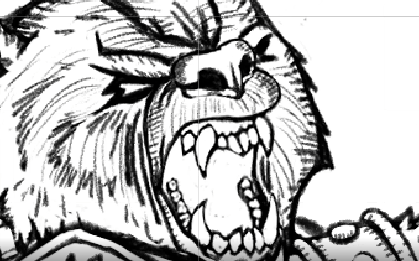
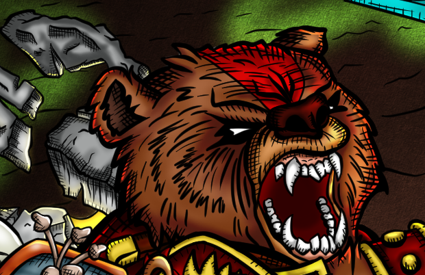
My board was soon filled with aggressive poses, medieval armor and weapons, and bears, lots of bears, to get Magnus' (the werebear) face just right.
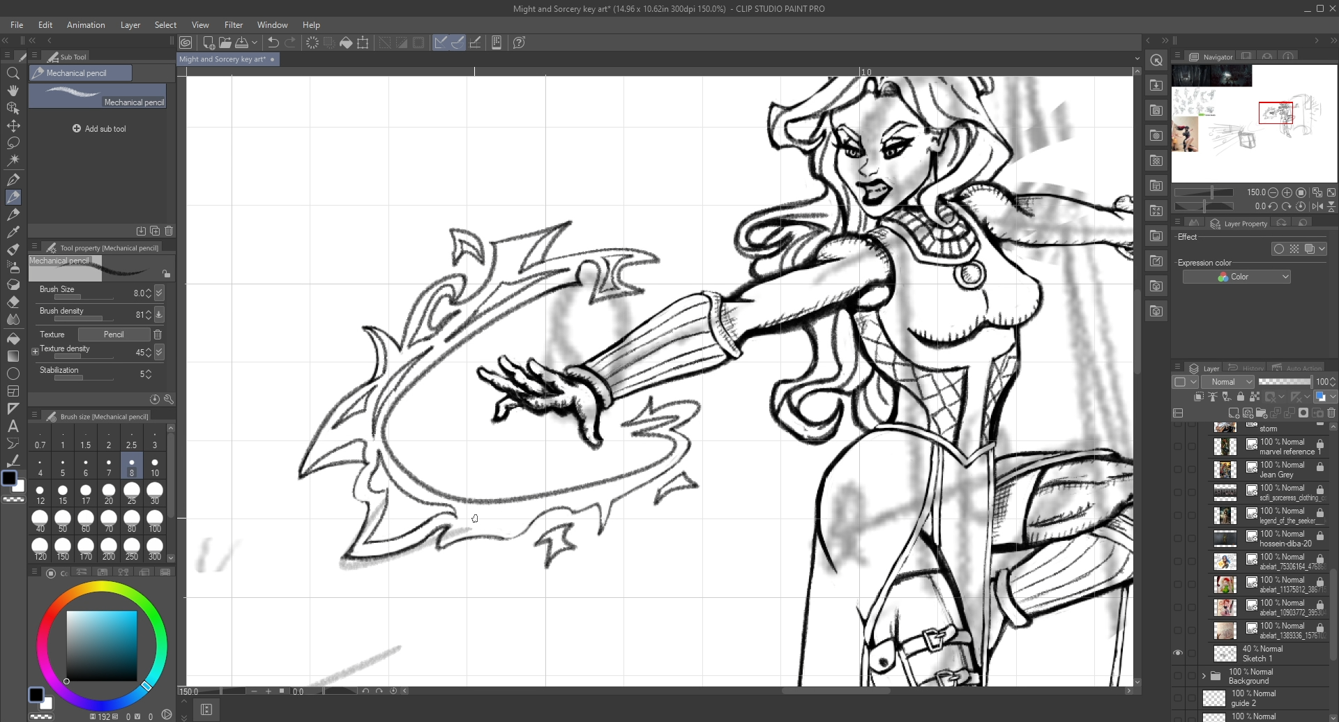
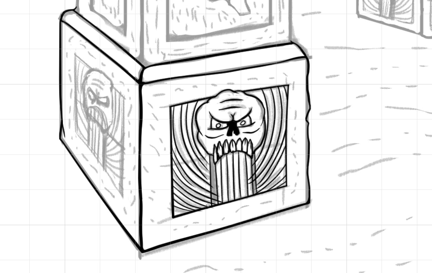
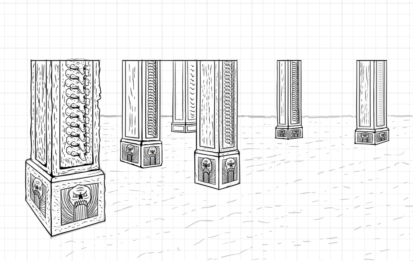
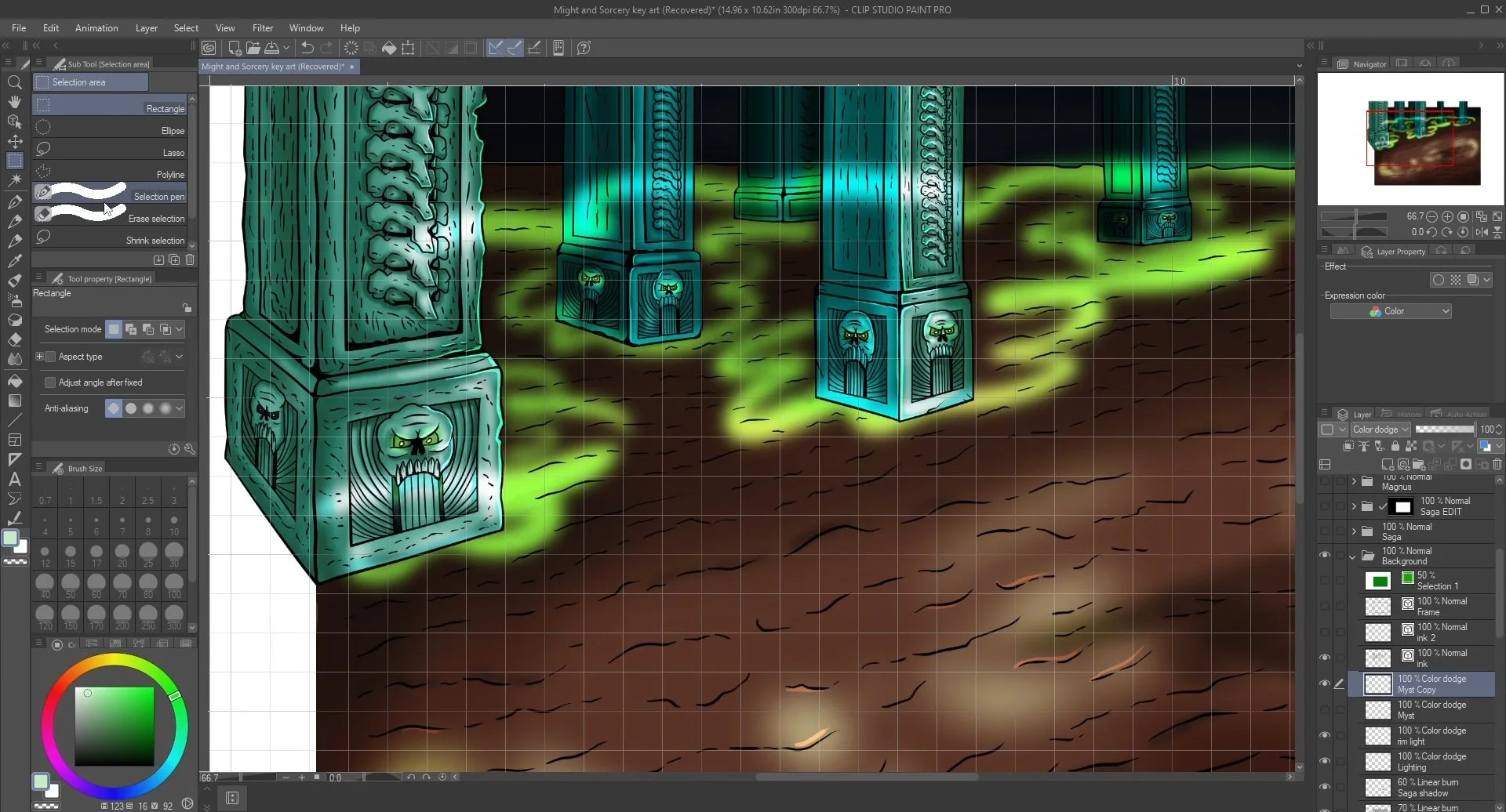
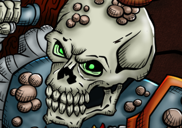
During the sketching and penciling phases, I focused on building the composition, and defining the details of every character, like the armor decorations (flames on the arm guards, the angry face on the shoulder plate, chainmail rings), magic effects on the spellcasters, and fungus on the decaying skeleton warriors.
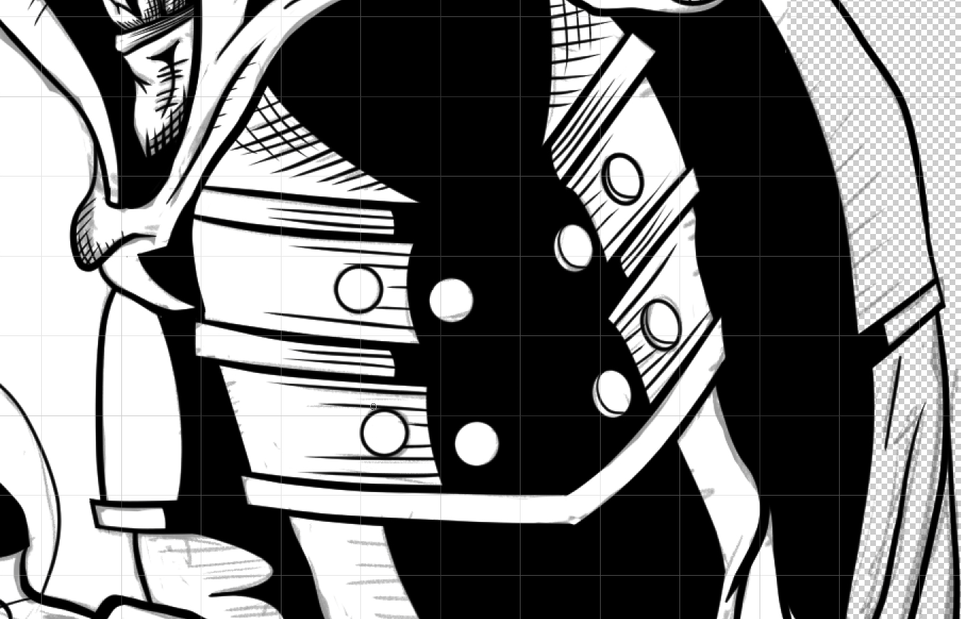
Dark variable ink strokes add depth, mimicking the classic comic style from game covers in the 1990s.
Hard shadows were established on the summoner featured in the foreground as large blocks of black ink, to intensify the silhouette effect, making it the darkest character in the entire composition.
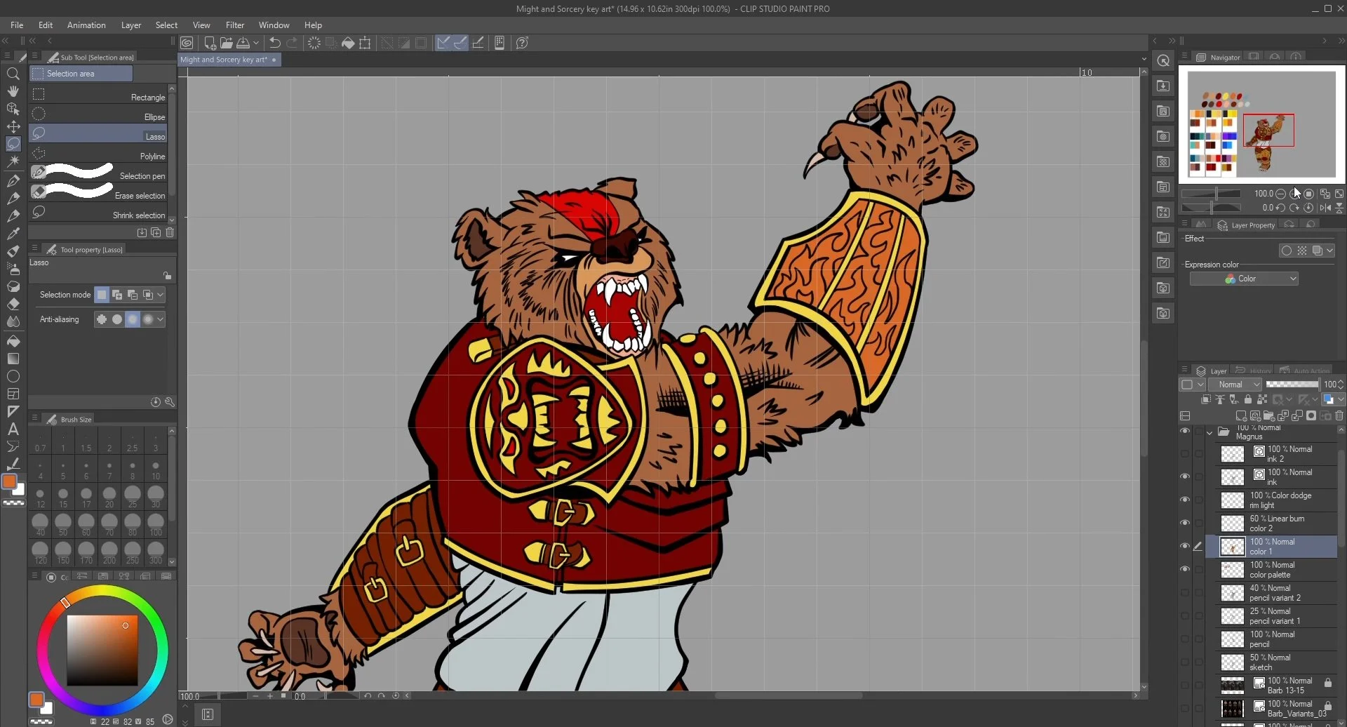
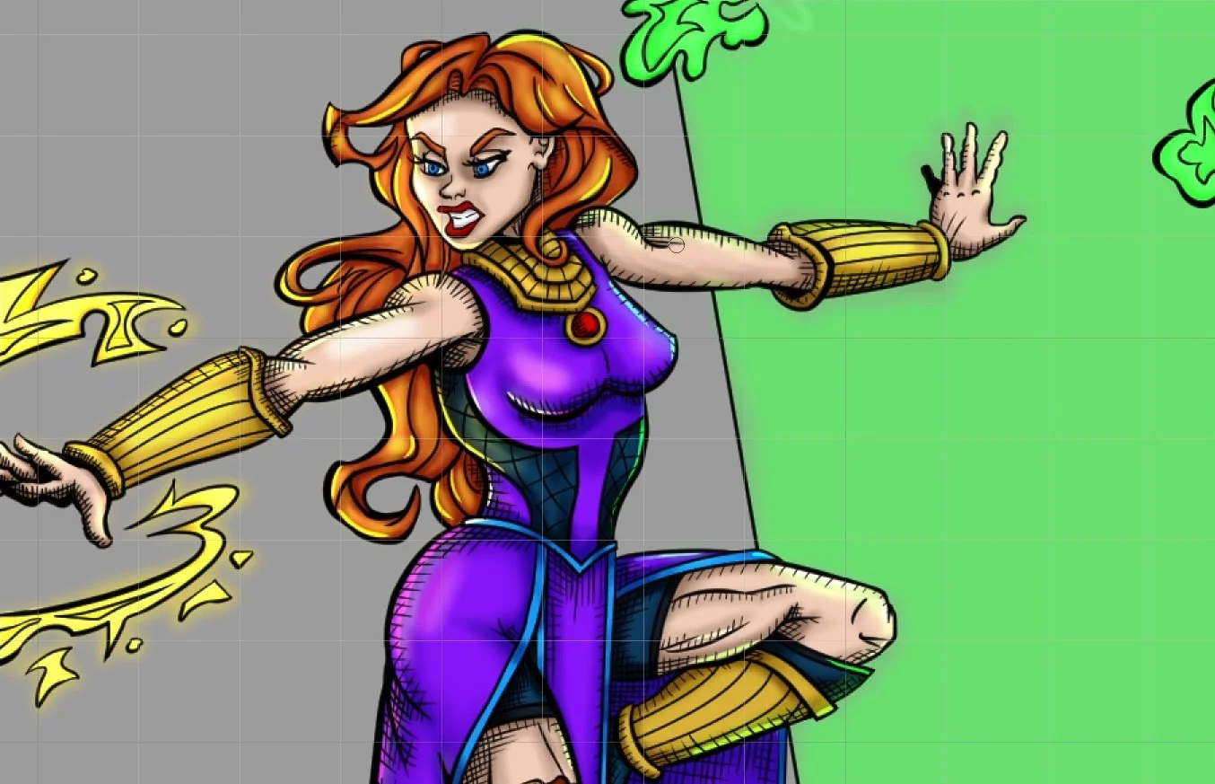
The main theme of the story is Contrast, so I used color and shading to manifest it. Magnus is mainly red and orange, while Saga (the sorceress) is purple and blue; decorations and spells stand out with complementary colors like yellow, orange, and green.
The background and enemies represent the darkness enveloping the light.
The Mines of Moria battle in The Lord of the Rings: The Fellowship of the Ring (2001) was a big inspiration for getting the tone and composition I wanted.
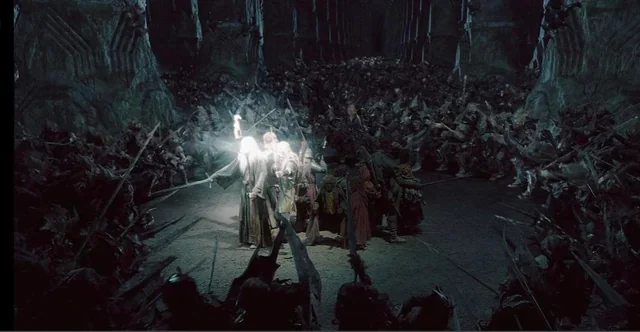
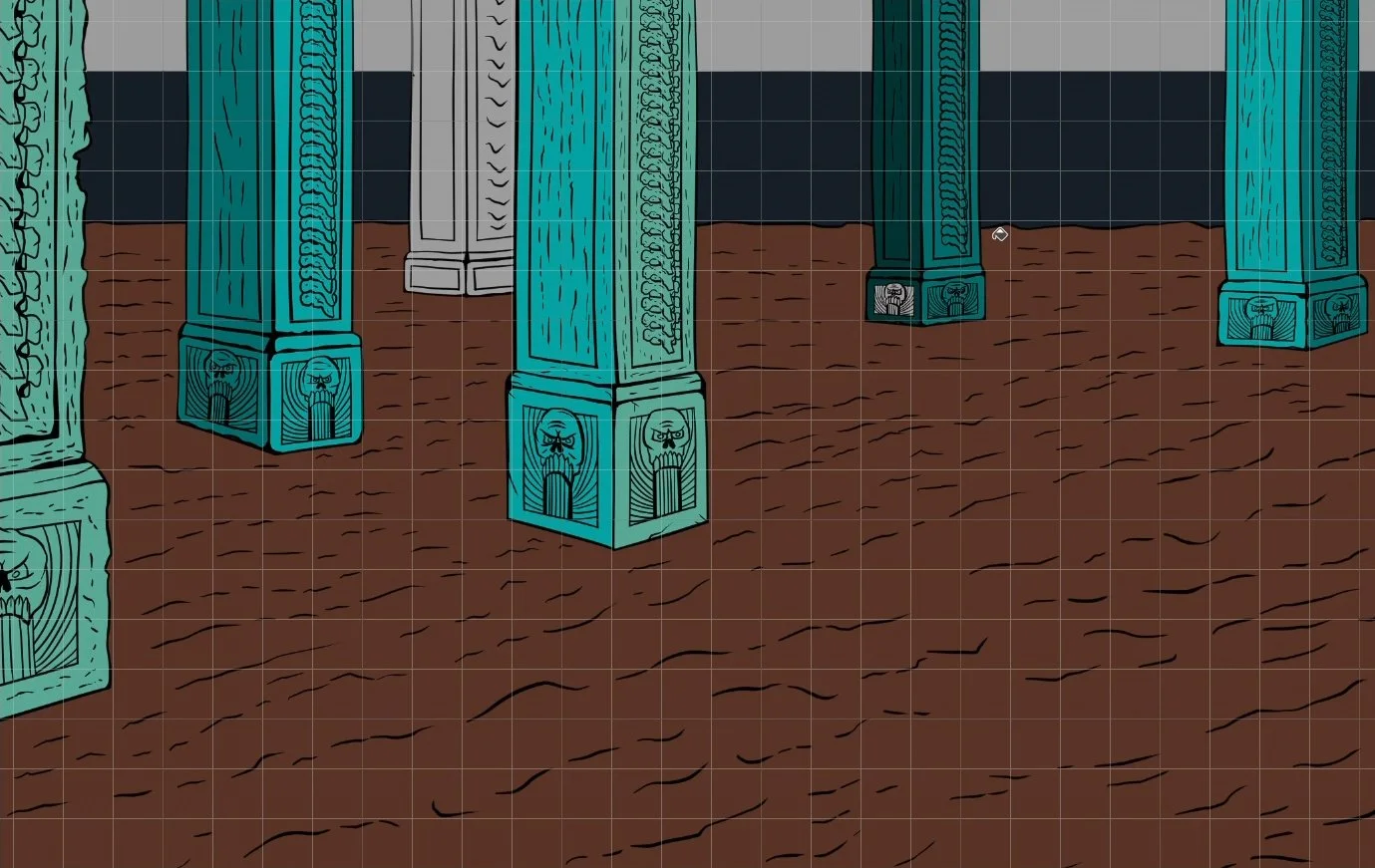
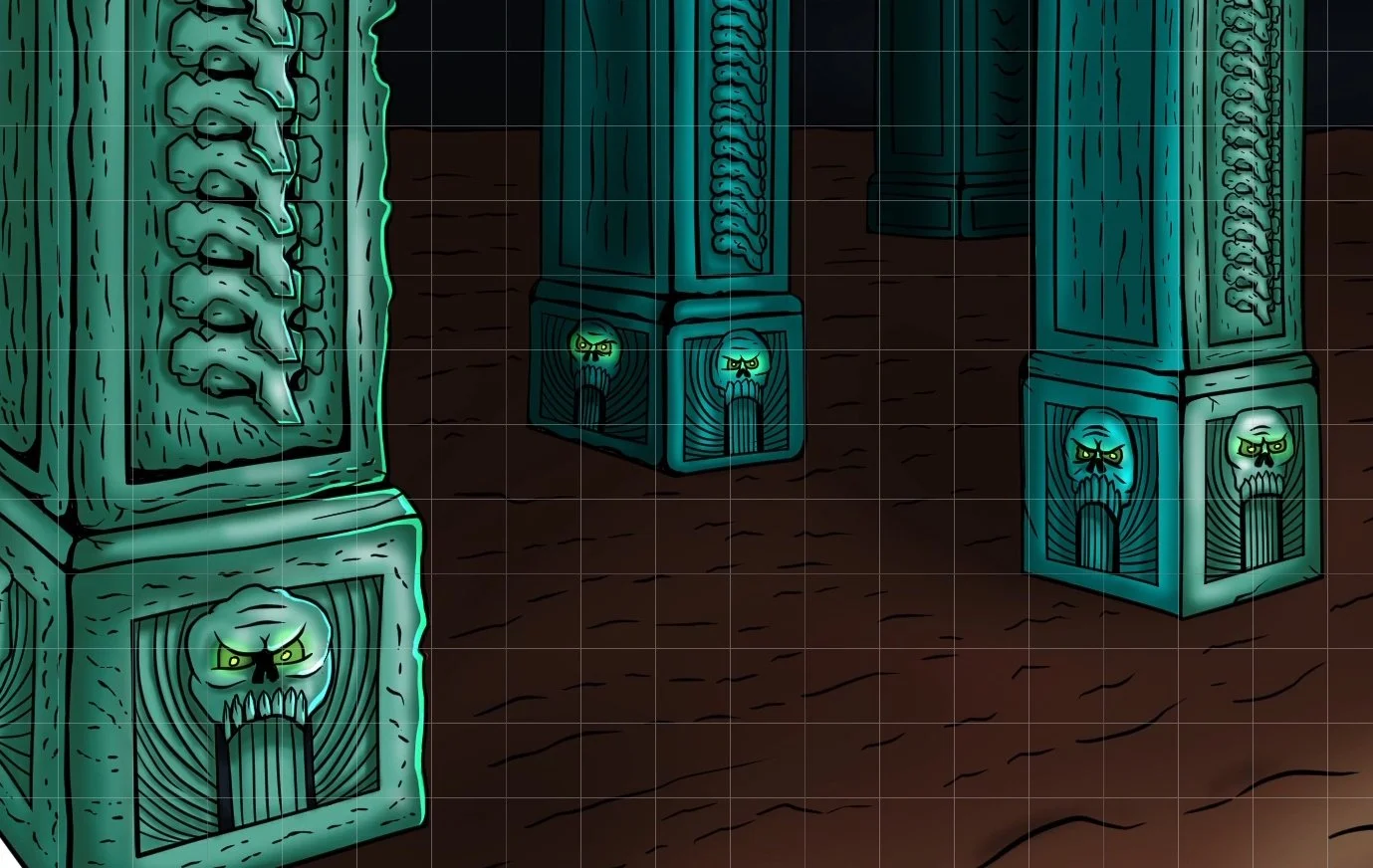
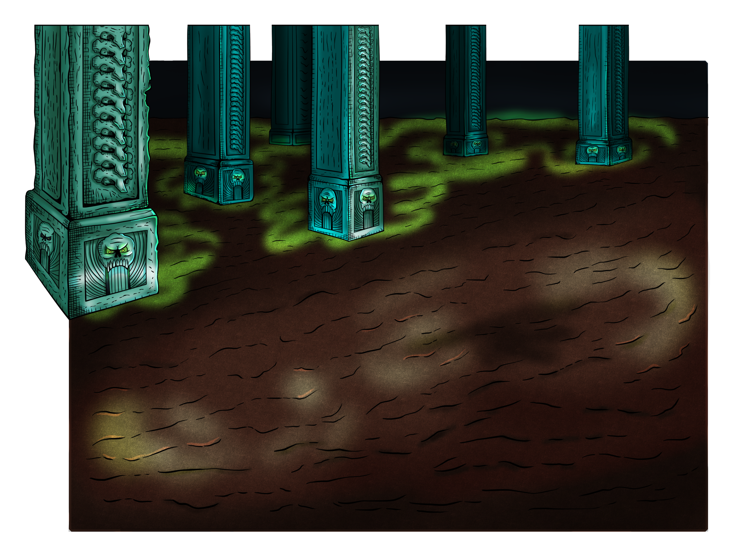
I designed the Underground Temple using a 2-point perspective technique. The rows of pillars form oblique lines, presenting an imposing front surrounding the characters, progressively fading away in the distance.
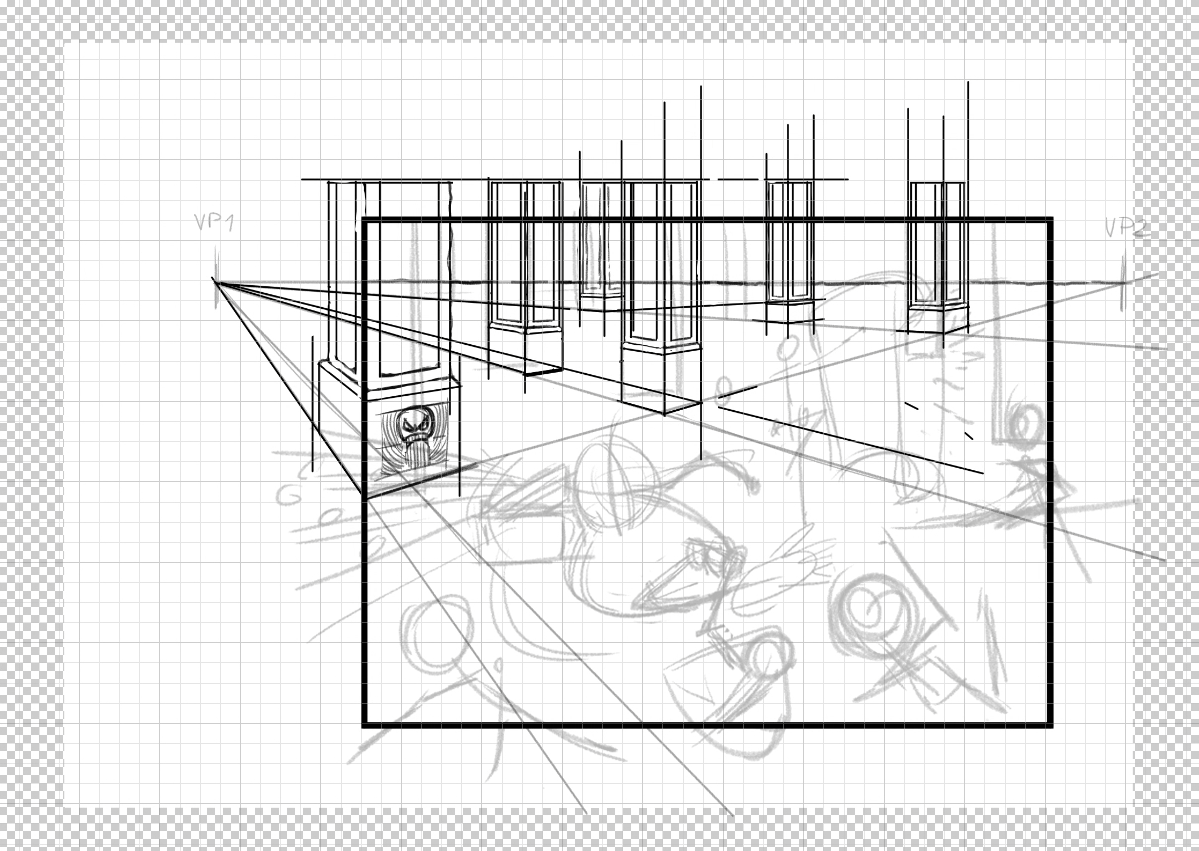
The "Arena" effect is created using dark tones and gradients for shading; darkness emanates from every angle, while the heroes serve as the primary light source, acting as beacons of hope.
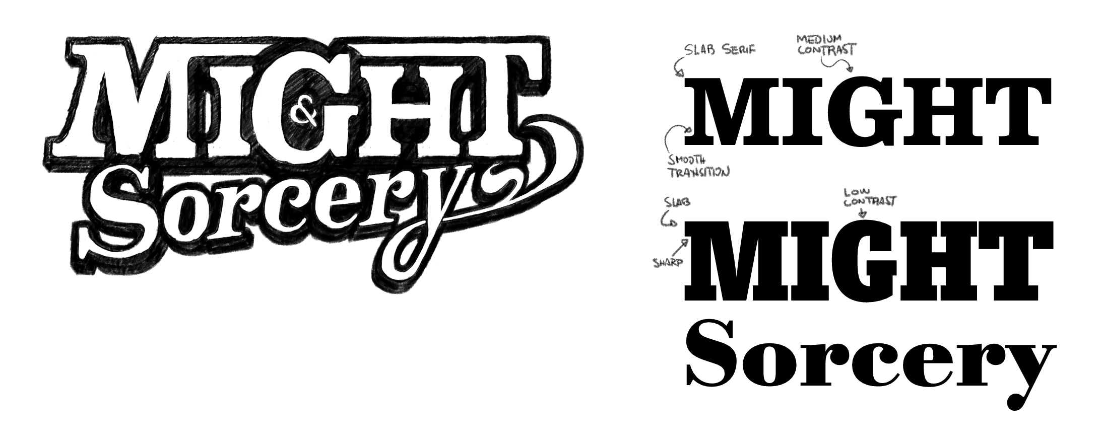
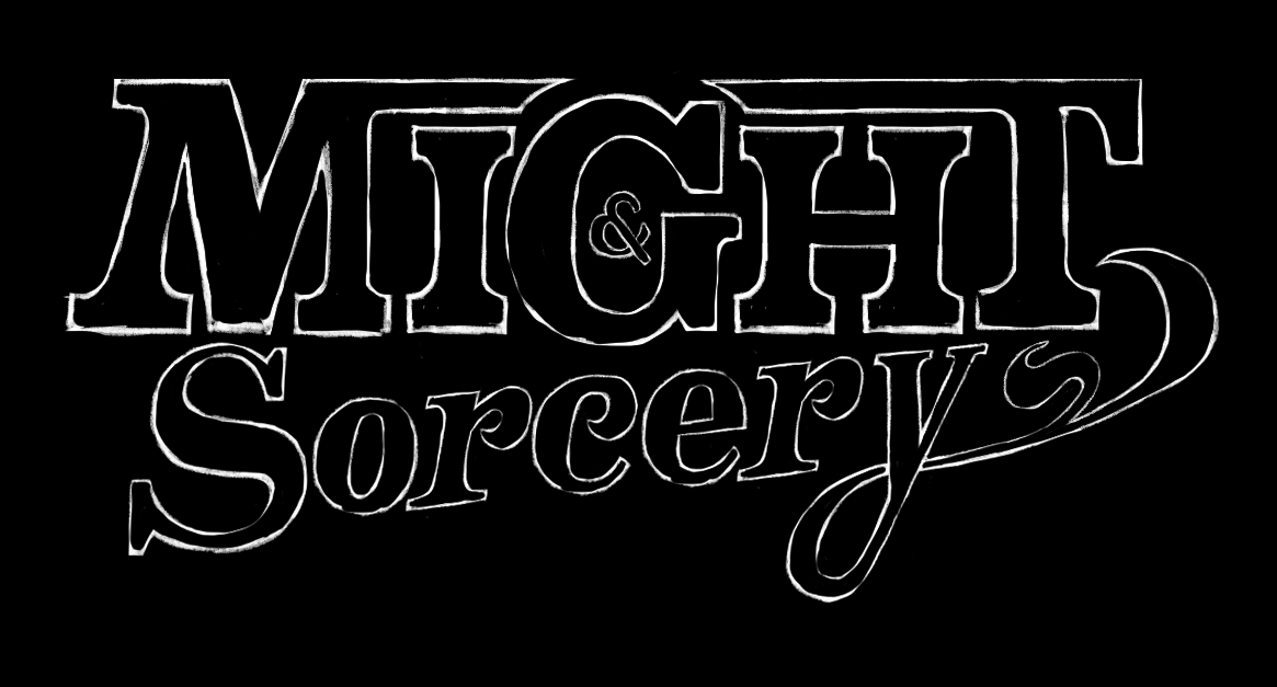
For the Logo, I wanted a clash between a bold slab serif font versus a delicate transitional font; I lettered the former, adding features like smoother transitions for the serifs to make them look less rigid (strong but flexible like Magnus), and to the latter, I added flourishes to the terminals to represent the fluid nature of Saga's spells.
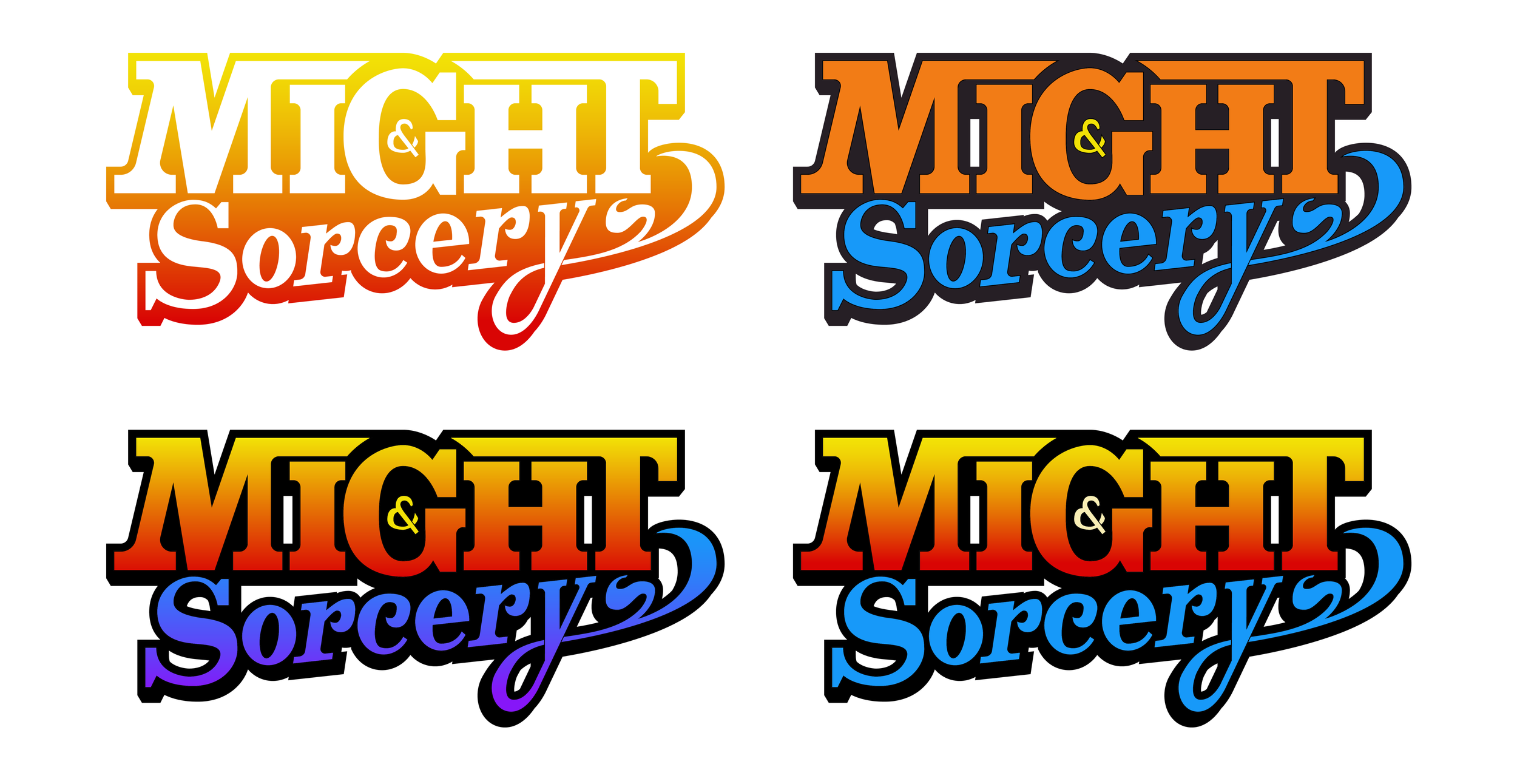
The color exploration for the Logo emanated from the character's color palette, pairing warm versus cold tones. I tried different combinations and gradients until I settled on a set that is readable on both dark and light backgrounds and also viable for both fabric and print with minor modifications.
Overwhelming Power and Charm
THE OUTCOME
In the end, I created a detailed landscape illustration with vibrant colors and high contrast, to be used as key art for the game; each character exists independently, allowing me to rearrange the composition as needed.
Depth of field:
a Gaussian blur was applied to the menacing enemy in the foreground, making him more mysterious and enticing for the viewers.
Textures:
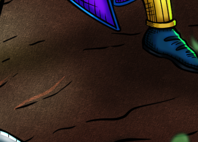
a pre-made dirt texture was added to the dungeon floor, making it gritty.
Shading and Crosshatching:
hard shadows are created with dark ink sections combined with crosshatching, reproducing a classic comic vibe.
Glowing effects:
magic spells and eerie eyes were highlighted with glow filters and low opacity.
Rim Light:
spells are the main lighting source in this pitch-black environment, illuminating the characters' faces and bodies from the front, and delineating them with bright lines from the back.
With minor changes, I made assets for the entire game marketing process, including game covers (vertical and horizontal), a game banner (extra-wide horizontal), promotional posters, arcade cabinet art, and more.